Blog Archive
-
▼
2011
(203)
-
▼
January
(37)
- 2011~365-31
- 2011~365-30
- 2011~365-29
- 2011~365-28 *Ball
- Ball Assignment
- 2011~52-4
- 2011~365-27
- 2011~365-26
- 2011~365-25
- 2011~365-24
- 2011~365-23
- 2011~365-22 *E&E-Excited!
- 2011~365-21
- 2011~52-3
- 2011~365-20
- 2011~365-19 *Shape Challenge: Donut
- 2011~365-18
- 2011~365-17
- 2011~365-16
- 2011~365-15
- 2011~365-14 *Upside Down
- 2011~52-2
- 2011~365-13
- 2011~365-12
- 2011~365-11
- 2011~365-10
- 2011~365-9
- 2011~365-8
- 2010~365-7
- 2011~52-1
- 2011~365-6
- 2011~365-5
- 2011~365-4
- 2011~365-3 *2011
- 2011~365-2
- L2L January
- 2011~365-1
-
▼
January
(37)
Labels
- 2010 365 Project (338)
- 2011 365 Project (179)
- 2012 MCP Project 12 (2)
- 365 (1)
- 5 (1)
- 52 Weeks Self Portrait Project (45)
- A B See (8)
- accessories (1)
- assignment (61)
- Audubon Zoo Series (16)
- award (2)
- Baton Rouge Zoo Series (8)
- beach photography (4)
- Beach Series (29)
- Cameron (20)
- celebrations (1)
- Change of Command Series (2)
- classes (2)
- Cole (23)
- contest (1)
- contests (5)
- Corn Maze Series (7)
- Creativity Boot Camp (13)
- Downtown BR Series (10)
- Elliott (3)
- Emotions/Expressions Assignment (4)
- Fairhope Series (17)
- flowers (1)
- I ♥ Faces (8)
- I Spy assignment (4)
- kids (18)
- Kiva Dunes Series (5)
- Levi (43)
- Literature to Life Challenge (5)
- LSU FETI Series (6)
- Luke (24)
- MCP Project 52 (3)
- Melody (2)
- memes (2)
- Micah (72)
- Miriam (50)
- mommytography (37)
- Naval Aviation Museum (5)
- Perkins Rowe Series (8)
- photography (53)
- photoshop fix (6)
- portraits (8)
- Projects (2)
- red (4)
- Rural Life Museum Series (10)
- Scavenger Hunt (2)
- shadow assignment (1)
- Shape Challenge (4)
- shoes (1)
- Snow Series (8)
- Strawberry Patch Series (8)
- Tech assignment (4)
- The 365 Project (359)
- This or That Thursday (4)
- USA Children's Park Series (8)
- word assignment (4)
- Wordless Wednesdays (14)


9 comments:
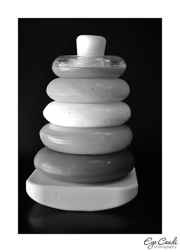
I like the second one, for two reasons. It's an unexpected presentation of the toy, and it has that glimmer of a reflection.
I love the first one! The light and colors!
I think I like the second shot the best for creativity but the first is really nice too, for composition.
I like them both for different reasons. 1st is great color and it's appealing to the eye. The 2nd one is NOT what you expect and really draws you in.
First one. You are so talented.
I like the first one the best!! The dark background really makes the colors pop!
I can't decide which is better...both excellent!!! But what I do know...your skills have grown so much in the past few years! You are a pro!!!
Love the first one!
I like the second one - although I can't exactly explain why. They're both great, though. Fun choice!
Post a Comment